
Showing posts with label Sophie. Show all posts
Showing posts with label Sophie. Show all posts
Friday, 13 January 2012
Feedback
Today in class we all looked at each others digipaks to comment on what they should improve on and what we liked about it.
 After sitting down and reading the comments, I corrected what they picked up on, it helped to have criticism from other class members as they knew what to look for and as our audience they knew what they wanted to see.

Friday, 6 January 2012
Editing the final video
Today we put the finishing touches to our music video, we made the narrative easier to understand and also corrected the syncing issues.
More hands make light work so whilst Katie worked on the syncing problems, I began to work on the titles.
 I wanted to make them shocking and enticing, so I put them on a black background so that the white really stood out. This title was placed with the getting ready scenes.
 I started to consider the options for the titles that we could have and would work. I thought about the feedback we had received for the narrative side of things and people had found it hard to understand, so I came up with the idea of an opening title saying 'Once Upon a Time' this gives a really good feel to the video, and links in with the narrative as it is very happy and fairytale like at the beginning.
 But by the time you get to the end of the video, the circumstances are very different. At the end of a fairytale you get the generic ' and they lived happily ever after' I put a twist on this by leaving out 'happily' giving our audience a blunt finish, but also a slight cliffhanger, as it doesn't state what happens next between them.
 This is under the control tab when creating titles, this is where I arranged where I wanted the title on the screen and chose the sizes.
 When I arranged the titles, they looked too still and dull for the beat of our chosen track, so I decided to exaggerate the titles, I did this by cutting the title segment into three or four pieces, I then went into the motion controls for each one and scaled it bigger, moved it up slightly or down, this gave a great distorted effect. I also put the filter 'Bad Film' onto it as the jitter of it makes it look exaggerated and distorted, leaving a rock and roll feel, which links to our image.
More hands make light work so whilst Katie worked on the syncing problems, I began to work on the titles.


 When I arranged the titles, they looked too still and dull for the beat of our chosen track, so I decided to exaggerate the titles, I did this by cutting the title segment into three or four pieces, I then went into the motion controls for each one and scaled it bigger, moved it up slightly or down, this gave a great distorted effect. I also put the filter 'Bad Film' onto it as the jitter of it makes it look exaggerated and distorted, leaving a rock and roll feel, which links to our image.
Thursday, 5 January 2012
Narrative.
When we set up the Facebook page for our band so that we could receive feedback, the main point that was raised was that people thought the narrative was too quick and they found it hard to grasp the concept of the story. So I thought up some ideas, and one idea I had seen in a music video by one of my favourite bands, Asking Alexandria and its the music video for their song 'To the Stage' and what they had done was added titles in some points of their narrative, for dialogue, and also to bring the audience into the present events. I though this idea would work well our music video.

This is at the beginning of the Asking Alexandria music video. It then takes us to what happened previously to what we just saw. The font is rock and roll.

They use it again a bit further on, but this time as dialogue. This entices the audience more as it's so shocking, and with the following '...' gives us the chance to make assumptions that something may go wrong.

This is the basic idea for what we want it to say, it will be placed just after the shots of myself getting ready to go out.
I then started to consider fonts that were just as shocking as the ones used in the 'To the Stage' video.


I went on to dafont.com to have a look at some of their fonts in the 'Horror' and 'Distorted' categories. We saw loads that we liked but these were our top four.
We then had an idea to use the font that we used for our digipak, which is the top screenshot. We thought this would link our video and digipak together more.


Thursday, 1 December 2011
Digipak Developed Ideas.
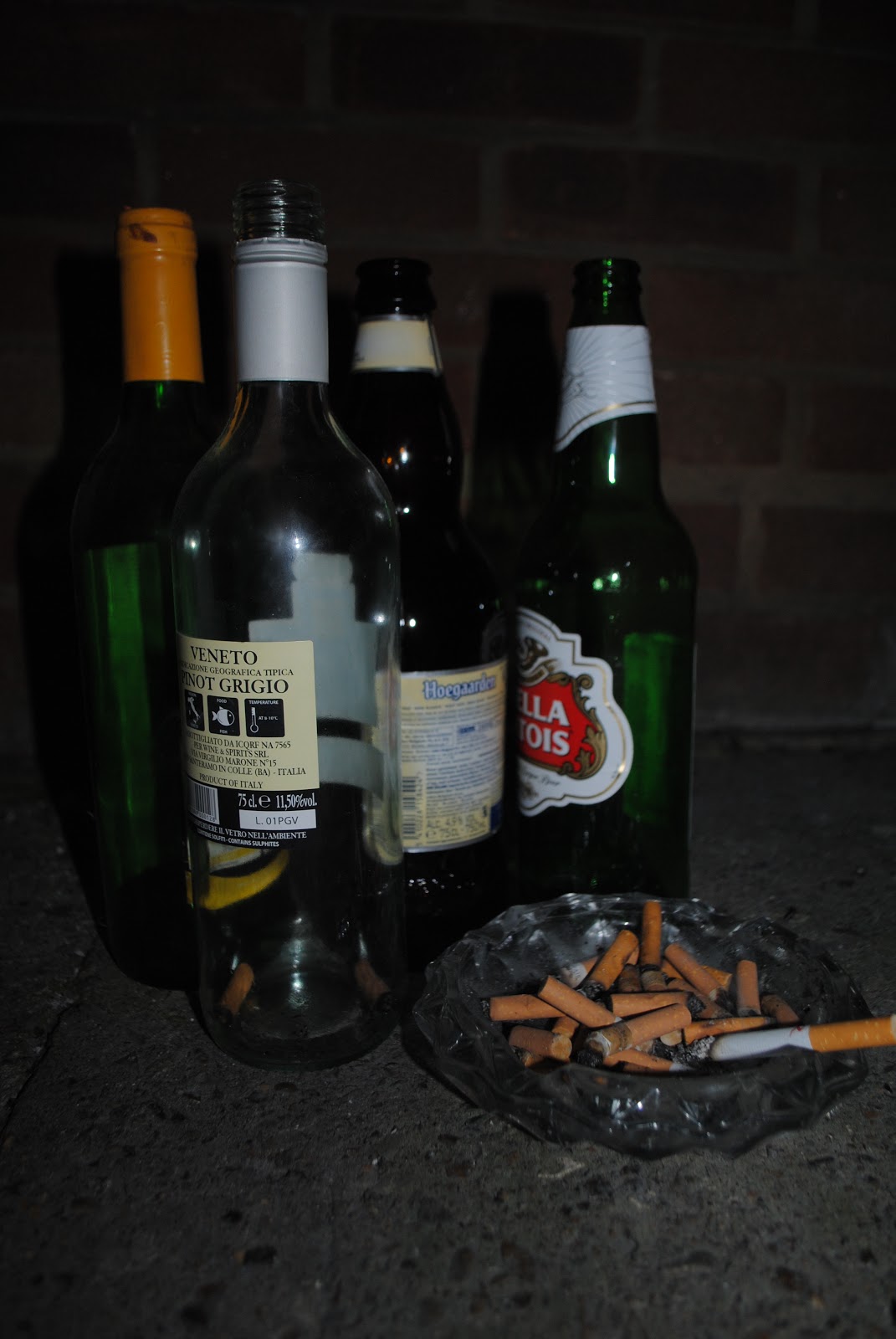 |
| This was the original photo that I took, for the back of the digipak. I arranged it outside so that it looked abstract and fitted in with our image. |
 |
| I experimented with different techniques of editing like contrast and exposure, and also added a black and white effect but only colouring some of the image in. |
 |
| We felt like the image we had come up with was too basic, we wanted it to look professional, so after experimenting with photoshop, I came up with this. I put a black and white effect over it with glowing edges and also experimented with the saturation. When it came to the text I rotated it and put the Opacity down. After I had done this I put surface blur over the top of it, so the text looks like it is actually in the bottle. |
Thursday, 17 November 2011
Monday, 14 November 2011
Digipak Research
I started to look at digipaks so that we knew what we was doing for ours and how we could do it, also starting to think about possible designs for our one.
Current Digipaks:


 I started off by making a brainstorm, considering everything like the image we have made for our band, the point we are trying to put across and I was also trying to incorporate the bands name and other significant symbols.
 It then lead me to design this, it was a rough sketch of what I had in mind. We have the bands name above it, and then two worlds colliding, which was my incorporation of the bands name. Then just underneath we have two hands holding both worlds wearing rings, which is significant of the video.

 This is their original font/logo for their first album and their latest E.P.
We like the style of it but one of the conditions of myself and Katie using their song, was that we didn't use their bands name in it, so we have come up with a new one, 'Amber Skies'
 Myself and Katie really like most of them but our favourites have to be the top three. Once we have sorted and designed our digipak cover properly, we will start to consider which font looks best and then pick one.


Current Digipaks:

This helped me understand what a digipak was and how it was produced. This started to get me thinking about possible ideas for our own.


Brainstorming for our own digipak:


After developing my idea further, this is what I came up with, instead of two worlds colliding it is two rings and in the middle or behind them we will photoshop in a galaxy so it seems that the rings are representing two worlds, which is very symbolic of our video.
Fonts:

We like the style of it but one of the conditions of myself and Katie using their song, was that we didn't use their bands name in it, so we have come up with a new one, 'Amber Skies'


Friday, 11 November 2011
Back Up plan.
Seeing that we are filming in the middle of November, weather may be an issue, especially because our performance location is outside, and we will also be handling electronic equipment such as amplifiers and microphones, and we don't want the bands equipment to get wet, so we have devised a back up plan in case the situation arises.
If this does happen, we will use the schools dark room to film the band in front of a green screen, we will then film the location on a separate day and in editing, we will put the location behind them, this is to make it look as if they were actually there.
 The dark room with the green screen already set up.

If this does happen, we will use the schools dark room to film the band in front of a green screen, we will then film the location on a separate day and in editing, we will put the location behind them, this is to make it look as if they were actually there.


News.
Last night, I rung the guitarist from As Worlds Collide to inform them of what is going on with the music video and arrange dates of the shoot.
Unfortunately, Rob had spoke to the rest of the band and they had to pull out of the shoot, because it would be costing them a lot to come down from their area. They have still allowed us to use Halfway Home as our song, so we can still use our ideas and locations.
But we still need someone to be in it for the performance side of things, luckily, I am in contact with a few other bands, I spoke to the guitarist, Ben and lead singer, George, from the band Accidents, who are a bit more local. They said they would talk to the rest of the guys to see if they were up for it, but the issue raised was the dates of the shoot, so I said about changing the dates to suit them, as at the moment it is purely based around As Worlds Collide, but they say it doesn't seem like it will be a problem.
I am waiting to hear back from the guitarist tonight, and he will let me know if they can make it.
 This is Accidents, (from left)
Eddie Tindame; Guitar
Joe Kosma; Bass
Rory Bevis; Vocals ( he has since left, they have a new lead singer, George)
Marcus Reddick; Vocals
Ben Kosma; Guitar
Matt Wybourn; Drums

Unfortunately, Rob had spoke to the rest of the band and they had to pull out of the shoot, because it would be costing them a lot to come down from their area. They have still allowed us to use Halfway Home as our song, so we can still use our ideas and locations.
But we still need someone to be in it for the performance side of things, luckily, I am in contact with a few other bands, I spoke to the guitarist, Ben and lead singer, George, from the band Accidents, who are a bit more local. They said they would talk to the rest of the guys to see if they were up for it, but the issue raised was the dates of the shoot, so I said about changing the dates to suit them, as at the moment it is purely based around As Worlds Collide, but they say it doesn't seem like it will be a problem.
I am waiting to hear back from the guitarist tonight, and he will let me know if they can make it.

Eddie Tindame; Guitar
Joe Kosma; Bass
Rory Bevis; Vocals ( he has since left, they have a new lead singer, George)
Marcus Reddick; Vocals
Ben Kosma; Guitar
Matt Wybourn; Drums

Thursday, 10 November 2011
Mr Brightside- The Killers
This is what I produced when I was experimenting with Final Cut and editing to the beat using multi clip. The footage was filmed by other students but we edited it to create this. Unfortunately the performance was badly recorded and we didn't have enough footage to use, so we had to use the same shots.
Friday, 4 November 2011
Location Recce- Eynsford Castle


Tuesday, 1 November 2011
Asset List
Performance:
-Two Guitars
-A Drum Kit
-Bass Guitar
-Microphone (with lead)
-Three amps (one with each guitar)
-Two heads (mainly for effect)
Narrative:
-Two engagement rings
-Broken iphone
-Picture of Chris and other girl on his phone
Final Costume Ideas:
Chris:


This is a rough idea of what we want the bands costumes to look like, we want them in white tops that will be slightly different to each other. We chose white because Chris will be in all black, this will represent and reflect the bands purity and innocence, but Chris' guilt and the image he has been given for breaking my heart. The band members will also be wearing a hint of red with their outfit, like a bracelet or a scarf, just to keep the theme of love running through. We think this will work well because the black and white will contrast and represent the themes we want to highlight.
-Two Guitars
-A Drum Kit
-Bass Guitar
-Microphone (with lead)
-Three amps (one with each guitar)
-Two heads (mainly for effect)
Narrative:
-Two engagement rings
-Broken iphone
-Picture of Chris and other girl on his phone
Final Costume Ideas:
Chris:


This is a rough idea of what we want the bands costumes to look like, we want them in white tops that will be slightly different to each other. We chose white because Chris will be in all black, this will represent and reflect the bands purity and innocence, but Chris' guilt and the image he has been given for breaking my heart. The band members will also be wearing a hint of red with their outfit, like a bracelet or a scarf, just to keep the theme of love running through. We think this will work well because the black and white will contrast and represent the themes we want to highlight.
Friday, 7 October 2011


Monday, 3 October 2011
Image
We needed an image for our band, one that would suit them and the music they produced, we needed to consider everything we knew about them and also what would suit the music video we was going to make. It took us a long time to think of one, but after developing ideas and coming up with our final idea, we came up with an image for our band members.
The image we want to give them is represented in the video and runs all the way through, this image is Sex, Alcohol + Rock 'n' Roll.
We are representing this image in many different ways, with costumes, locations and narrative.
When it comes to costumes, we will probably have something like this:
Items of clothing like shirts, ripped jeans/skinny jeans and v-neck shirts will be worn, the three bands featured here are well known artists and are in the same genre/scene as our unsigned one.
Because of the theme of our music video being rock and roll etc, we might take some of our image ideas from the bottom band, we like the idea of black and grey colours with ripped jeans, as this would signify the pain and devastation of the relationship.
All of these featured bands are unique in their own way, so
The image we want to give them is represented in the video and runs all the way through, this image is Sex, Alcohol + Rock 'n' Roll.
We are representing this image in many different ways, with costumes, locations and narrative.
When it comes to costumes, we will probably have something like this:
 |
| Parkway Drive |
Because of the theme of our music video being rock and roll etc, we might take some of our image ideas from the bottom band, we like the idea of black and grey colours with ripped jeans, as this would signify the pain and devastation of the relationship.
 |
| We Are the Ocean |
 |
| Asking Alexandria |
Friday, 30 September 2011
The Prodigy Music Video analysis.
Women are objectified in this, to be looked at, the character grabs them
The character goes to a strip club, notion of looking, the point of a strip club is to look. The women are there for a sexual appeal and to become objects.
The character is acting like a man, and being represented as one.
The band comes across as masculine and laddish, extreme, anti-social, violent and unpredictable.
The whole video is shot in point of view, and the mirror at the end gives us an answer.
Intertextuality; 'lads mags' and the bands logo appears on one of the characters bodies.
Hyper-reality- the fact that the character is drunk.
The character goes to a strip club, notion of looking, the point of a strip club is to look. The women are there for a sexual appeal and to become objects.
The character is acting like a man, and being represented as one.
The band comes across as masculine and laddish, extreme, anti-social, violent and unpredictable.
The whole video is shot in point of view, and the mirror at the end gives us an answer.
Intertextuality; 'lads mags' and the bands logo appears on one of the characters bodies.
Hyper-reality- the fact that the character is drunk.
Thursday, 29 September 2011
Our final location(s)- Eynsford Castle, Camden Market and The Red Lion
Eynsford Castle:

 As well as this, in the editing process, we are going to make the scenes of Chris proposing to me in a bright, sunny environment, but when they perform its going to be dark and gloomy.
 Camden Market:


The Red Lion is a well known pub in the local area, due to the many gigs that they put on in a small club called 'Leo's'
The pub is known to attract a unique crowd and is a hot spot for many 'metal heads'
We thought this would be perfect for our scenes where I am trying to forget Chris.
This will be where I also have a sort of affair with the lead singer of the band.
We also liked this location because it kept in tie with our theme of 'Sex, Alcohol and Rock and Roll'

Subscribe to:
Posts (Atom)